고정 헤더 영역
상세 컨텐츠
본문
강의들으면서 적어놓은 Note.
1) View, Text, ScrollView
View 태그.
기존 App.js 내용을 지우고, 아래 코드로 넣어준다.
저장하고 Expo 앱을 통해 보면, 수정이 금방 된다.
import { StatusBar } from 'expo-status-bar';

import React from 'react';

import { StyleSheet, Text, View } from 'react-native';


export default function App() {

  return (

    <View style={styles.container}>

      <View style={styles.subContainerOne}></View>

      <View style={styles.subContainerTwo}></View>

    </View>

  );

}


const styles = StyleSheet.create({

  container: {

    flex: 1,

    backgroundColor: '#fff',

  },

  subContainerOne: {

    flex:1,

    backgroundColor:"yellow"

  },

  subContainerTwo: {

    flex:1,

    backgroundColor:"green"

  }

});


View 태그는 영역을 잡아주는 태그다.

자세히 배울 styleSheet로 스타일 변경.


App.js에 Text(아래 코드)를 붙여본다.


import React from 'react';

import { StyleSheet, Text, View } from 'react-native';


export default function App() {

  return (

    <View style={styles.container}>

      <Text>문자는 Text 태그 사이에 작성!!</Text>

    </View>

  );

}


const styles = StyleSheet.create({

  container: {

    flex: 1,

    backgroundColor: '#fff',

    alignItems: 'center',

    justifyContent: 'center',

  },

});
문자는 Text 태그 사이에 작성한다!
카톡이든 페북이든 스크롤을 올리면 계속 내용이 나오게 되어있다.
화면을 감싸는 View 태그가 하나 있고,
'영역을 충분히 갖는 텍스트입니다'라는 영역 또한 존재하다.
그걸 View태그로도 영역을 잡는다. (테두리는 style로 적용한 것)
화면이 넘치는 내용을 볼 때는 스크롤을 가능하게 하는 것이 ScrollView
아래는 두번째 코드.
import React from 'react';

import { StyleSheet, Text, View, ScrollView } from 'react-native';


export default function App() {

  return (

    <ScrollView style={styles.container}>

      <View style={styles.textContainer}>

        <Text style={styles.textStyle}>영역을 충분히 갖는 텍스트 입니다!</Text>

      </View>

      <View style={styles.textContainer}>

        <Text style={styles.textStyle}>영역을 충분히 갖는 텍스트 입니다!</Text>

      </View>

      <View style={styles.textContainer}>

        <Text style={styles.textStyle}>영역을 충분히 갖는 텍스트 입니다!</Text>

      </View>

    </ScrollView>

  );

}


const styles = StyleSheet.create({

  container: {

    flex: 1,

    backgroundColor: '#fff',

  },

  textContainer: {

    height:100,

    borderColor:'#000',

    borderWidth:1,

    borderRadius:10,

    margin:10,

  },

  textStyle: {

    textAlign:"center"

  }

});
복붙을 많이 하는데, 기존에 만들었던 코드들을 축적해놓고
필요할 때 빠르게 붙여서 쓰는 연습을 해보라.
코드는 타이핑이 목적은 아니다.
오류를 줄이고, 빠른 앱 개발을 위해서는 복붙도 필요하다.
[Button, Image]
<Button>
Button 코드를 붙여넣자.
import React from 'react';
import { StyleSheet, Text, View, Button, Alert } from 'react-native';
export default function App() {
return (
<View style={styles.container}>
<View style={styles.textContainer}>
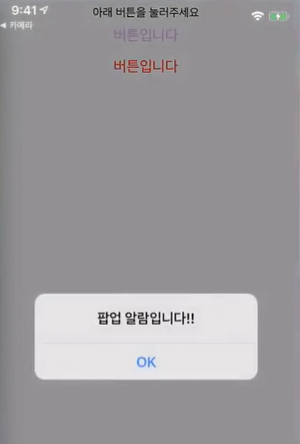
<Text style={styles.textStyle}>아래 버튼을 눌러주세요</Text>
{/* 버튼 onPress 속성에 일반 함수를 연결 할 수 있습니다. */}
<Button
style={styles.buttonStyle}
title="버튼입니다 "
color="#f194ff"
onPress={function(){
Alert.alert('팝업 알람입니다!!')
}}
/>
{/* ES6 문법으로 배웠던 화살표 함수로 연결 할 수도 있습니다. */}
<Button
style={styles.buttonStyle}
title="버튼입니다 "
color="#FF0000"
onPress={()=>{
Alert.alert('팝업 알람입니다!!')
}}
/>
</View>
</View>
);
}
const styles = StyleSheet.create({
container: {
flex: 1,
backgroundColor: '#fff',
},
textContainer: {
height:100,
margin:10,
},
textStyle: {
textAlign:"center"
},
});
title="버튼입니다 "
버튼 글씨를 변경하는 부분.
onPress 함수는, 화살표 함수로, 누르면 무언가 발생시키는 함수.
Alert.alert('팝업 알람')
Alert이라는 함수의 alert 도구를 이용해, 알림창을 띄우는 것.
버튼 사용설명서는 아래
https://reactnative.dev/docs/button
필요한 함수는, 함수 안에서 return 전 부분에 만들어줄 수 있다.
얼럿창을 뜨게 하는 함수를 만들어보자.
const customAlert = () =>{
Alert.alert("얼럿입니다!")
}
그리고 함수를 붙이는 방법은 두가지가 있다.
1) onPress={customAlert } 중괄호 안에 함수명 넣기.
2) 화살표 함수에 함수 집어넣기.
onPress={()=>{
customAlert()
}}
<TouchableOpacity/>
스타일 신경안쓰고, 버튼처럼 생기지 않고 영역으로 생긴것.
카카오톡을 예를들면 하나 방을 누르면 카톡방으로 들어간다.
근데 버튼이 아니고, 영역으로 누르는 것이다.
import React from 'react';

import { StyleSheet, Text, View, ScrollView, TouchableOpacity, Alert } from 'react-native';


export default function App() {

  const customAlert = () => {

    Alert.alert("TouchableOpacity에도 onPress 속성이 있습니다")

  }

  return (

    <ScrollView style={styles.container}>

      <TouchableOpacity style={styles.textContainer} onPress={customAlert}>

        <Text style={styles.textStyle}>영역을 충분히 갖는 텍스트 입니다!</Text>

      </TouchableOpacity>

      <TouchableOpacity style={styles.textContainer} onPress={customAlert}>

        <Text style={styles.textStyle}>영역을 충분히 갖는 텍스트 입니다!</Text>

      </TouchableOpacity>

      <TouchableOpacity style={styles.textContainer} onPress={customAlert}>

        <Text style={styles.textStyle}>영역을 충분히 갖는 텍스트 입니다!</Text>

      </TouchableOpacity>

      <TouchableOpacity style={styles.textContainer} onPress={customAlert}>

        <Text style={styles.textStyle}>영역을 충분히 갖는 텍스트 입니다!</Text>

      </TouchableOpacity>

      <TouchableOpacity style={styles.textContainer} onPress={customAlert}>

        <Text style={styles.textStyle}>영역을 충분히 갖는 텍스트 입니다!</Text>

      </TouchableOpacity>

      <TouchableOpacity style={styles.textContainer} onPress={customAlert}>

        <Text style={styles.textStyle}>영역을 충분히 갖는 텍스트 입니다!</Text>

      </TouchableOpacity>

      <TouchableOpacity style={styles.textContainer} onPress={customAlert}>

        <Text style={styles.textStyle}>영역을 충분히 갖는 텍스트 입니다!</Text>

      </TouchableOpacity>

    </ScrollView>

  );

}


const styles = StyleSheet.create({

  container: {

    flex: 1,

    backgroundColor: '#fff',

  },

  textContainer: {

    height:100,

    borderColor:'#000',

    borderWidth:1,

    borderRadius:10,

    margin:10,

  },

  textStyle: {

    textAlign:"center"

  }

});
<이미지 태그>
import React from 'react';

import { StyleSheet, Text, View, Image } from 'react-native';

//이렇게 상단에 가져와 사용할 이미지를 불러옵니다

import favicon from "./assets/favicon.png"


export default function App() {

  return (

    <View style={styles.container}>

            {/*이미지 태그 soruce 부분에 가져온 미지 이름을 넣습니다 */}

      <Image

        source={favicon}

                // 사용설명서에 나와 있는 resizeMode 속성 값을 그대로 넣어 적용합니다

        resizeMode={"repeat"}

        style={styles.imageStyle}

      />

    </View>

  );

}


const styles = StyleSheet.create({

  container: {

    flex: 1,

    backgroundColor: '#fff',

    //혹시 미리 궁금하신 분들을 위해 언급하자면,

    //justifyContent와 alignContent는 영역 안에 있는 콘텐츠들을 정렬합니다

    justifyContent:"center",

    alignContent:"center"

  },

  imageStyle: {

    width:"100%",

    height:"100%",

    alignItems:"center",

    justifyContent:"center"

  }

});
작은 이미지가 흩뿌려져있다.
import favicon from "./assets/favicon.png"
assets/favicon.png를 가져왔다.
기본적으로 Expo에서 주는 이미지다.
resizeMode={"repeat"}
이미지 배치를 반복한다는 의미
Image 공식문서 참고하자.
<두번째 Image 방법. 외부 이미지 가져오기>
import React from 'react';

import { StyleSheet, Text, View, Image } from 'react-native';

//이렇게 상단에 가져와 사용할 이미지를 불러옵니다

import favicon from "./assets/favicon.png"


export default function App() {

  return (

    <View style={styles.container}>

            {/*이미지 태그 soruce 부분에 가져온 미지 이름을 넣습니다 */}

      <Image

        source={{uri:'https://images.unsplash.com/photo-1424819827928-55f0c8497861?fit=crop&w=600&h=600%27'}}

                // 사용설명서에 나와 있는 resizeMode 속성 값을 그대로 넣어 적용합니다

        resizeMode={"cover"}

        style={styles.imageStyle}

      />

    </View>

  );

}


const styles = StyleSheet.create({

  container: {

    flex: 1,

    backgroundColor: '#fff',

    //혹시 미리 궁금하신 분들을 위해 언급하자면,

    //justifyContent와 alignContent는 영역 안에 있는 콘텐츠들을 정렬합니다

    justifyContent:"center",

    alignContent:"center"

  },

  imageStyle: {

    width:"100%",

    height:"100%",

    alignItems:"center",

    justifyContent:"center"

  }

});
코드가 넘어가서 잘 안보인다?
Alt Z를 눌러서 전체 자동 줄바꿈 적용 가능하다.
[앱 화면 만들기] 구성한 화면 꾸미기, Styles
react-navtive의 StyleSheet라는 도구. container를 통해 옷에 뼈대를 입혀줄 수 있다.
자주 사용하는 스타일이 뭐가 있나를 볼 거다.
container 부분의 속성들.
flex. 화면에 대한 내용. 1은 전체화면을 가져감
background color 는 배경색
justifyContent, alignContent는 정렬방향과 위치.
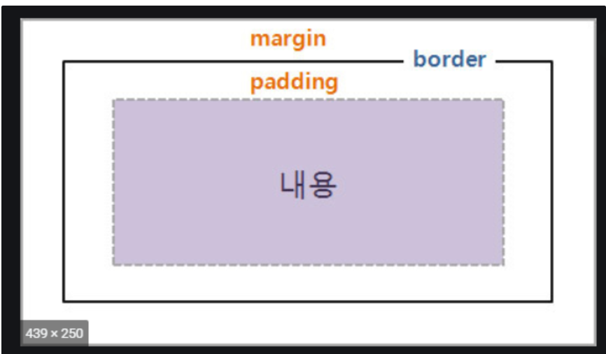
textContainer부분은, 마진(영역(컨텐츠) 바깥 공간의 이격)
패딩(컨텐츠 안에서 이격 공간)
borderRadius(테두리 구부러짐)
borderWidth(테두리 두께)
borderColor(테두리 색)
borderStyle(테두리 스타일)
textStyle에서는 글자 관련 속성을 변경할 수 있다.
[Flex : 컨텐츠의 위치]
앱화면 구성시에 정말 중요한데 어려워들 한다.
응용 연습이 필요하다.
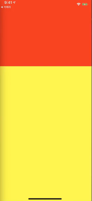
빨간, 노란화면이 나눠져있다.
전체 container에 대해, flex 1을 하여 전체화면을 차지한다.
container One(빨강)은 flex 1
Two(노랑)은 flex 2.
전체를 3으로 보면, 1/3 영역을 빨강이 갖고, 노랑은 2/3을 가진다.
부모의 영역을 각각 가지는 것임!
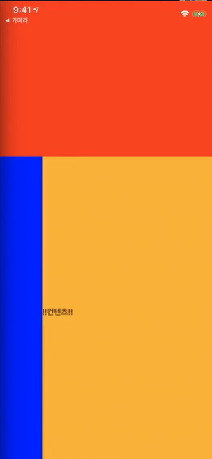
<다음 flex>
전체 container는 flex 1.
container one과 two가 있다.
그런데 two에 innerOne, innerTwo 두개가 있다.
그 크기는 상대적이다.
one과 two의 비율대로 화면을 나눠가지고,
two는 그 안에 있는 inner one, two 두개의 비율로 구성된다.
flex 2 : flex 2나, 3:3은 똑같다. 비율일 뿐이다.
두개의 숫자 합이 분모, 각 flex 숫자가 분자가 된다.
flexDirection
- 내부 영역의 방향.
import React from 'react';
import { StyleSheet, Text, View } from 'react-native';
export default function App() {
return (
<View style={styles.container}>
<View style={styles.containerOne}>
</View>
<View style={styles.containerTwo}>
<View style={styles.innerOne}>
</View>
<View style={styles.innerTwo}>
</View>
</View>
</View>
);
}
const styles = StyleSheet.create({
container: {
flex:1
},
containerOne: {
flex:1,
backgroundColor:"red"
},
containerTwo:{
flex:2,
flexDirection:"row",
backgroundColor:"yellow"
},
innerOne: {
flex:1,
backgroundColor:"blue"
},
innerTwo: {
flex:4,
backgroundColor:"orange"
}
});
flexDirection:"row",
부모영역 안에있는 컨텐츠를 좌우로 배치시키겠다는 의미.
상하는? column
<justfiyContent>
flexDirection과 동일한 방향으로 내부 컨텐츠를 정렬하는 도구
import React from 'react';
import { StyleSheet, Text, View } from 'react-native';
export default function App() {
return (
<View style={styles.container}>
<View style={styles.containerOne}>
</View>
<View style={styles.containerTwo}>
<View style={styles.innerOne}>
</View>
<View style={styles.innerTwo}>
<Text>!!컨텐츠!!</Text>
</View>
</View>
</View>
);
}
const styles = StyleSheet.create({
container: {
flex:1
},
containerOne: {
flex:1,
backgroundColor:"red"
},
containerTwo:{
flex:2,
flexDirection:"row",
backgroundColor:"yellow"
},
innerOne: {
flex:1,
backgroundColor:"blue"
},
innerTwo: {
flex:4,
justifyContent:"flex-start",
backgroundColor:"orange"
}
});
기존 코드에서 text가 추가되었다.
그리고 justifyContent:"flex-start" 가 있는데.
flex-start, flex-end 로 위치를 변경할 수 있다.
자동완성으로 center도 있고, 다양한 옵션들이 있다.
디폴트는 상하 정렬이다.
flexDirection을 설정하지 않았기에, start, end는 현재 디폴트다.
left end 대신에 start, end가 있다. 대신 위치를 flexDirection으로 설정하면 된다.
alignItems
flex-start는 왼쪽 상단에 붙게되고,
center는 가운데에 붙는다.
즉, flexDirection과 반대방향으로 배치가 된다.
row로 설정했으면, alignItems는 그와 반대(column)으로 배치가 된다.
'앱 개발 Project' 카테고리의 다른 글
| 앱개발 강의 3주차 Note - (2) 앱 상세화면 만들기 - useState, useEffect (0) | 2020.11.19 |
|---|---|
| 앱개발 강의 3주차 Note - (1) 앱 상세화면 만들기 - 앱 필수 기초지식 (0) | 2020.11.15 |
| 앱개발 강의 2주차 Note - (2) 앱화면 만들기 - Expo (0) | 2020.11.07 |
| 앱개발 강의 2주차 Note - (1) 리액트 네이티브 앱 개발 시작 (0) | 2020.11.06 |
| 앱개발 강의 1주차 Note - (4) 앱개발에 자주 쓰이는 함축적인 JS 문법 (0) | 2020.11.03 |


